Forge!
Battle-System
Forge!
A fully system-agnostic RPG builder for Owlbear Rodeo. Forge ships with a complete D&D 5e system, so you can start immediately with no setup. If you want more control, Forge lets you define custom attributes, group them into named game systems, and design the card and list layouts used in-game. Whether you're running D&D 5e, a custom sci-fi hack, or a diceless narrative game, Forge gives you the foundation to build it your way.
Features:
- Built-in D&D 5e system, ready with zero setup.
- Custom attributes with multiple data types.
- Named game systems for organizing attributes.
- Unit card layouts for character sheets.
- Unit list layouts for the initiative tracker.
- Per-system theming with custom colors and background art.
- Share IDs for importing systems.
- Formula support with dice notation and cross-attribute references.
- Custom system building through the Battle-System website.
Table of Contents
- How Forge Works
- Navigating Forge
- The Initiative Tracker
- The Unit Card
- The Party View
- The System Page
- Extension Settings
- Building Custom Systems (Battle-System Website)
- Tips and Tricks
- Support
How Forge Works
You do not need to build anything to use Forge. It ships with a complete D&D 5e system — attributes, card layout, and list layout are pre-configured and ready to use. Add Forge to your Owlbear Rodeo room, select the default system, and start playing.
Custom system building is entirely optional and is done through the companion Battle-System website — completely separate from the extension itself. When you are ready to go beyond the default system, see Building Custom Systems for a full guide.
Navigating Forge
Forge opens as a panel inside your Owlbear Rodeo room. A small menu button (≡) at the bottom-left of the panel opens the navigation menu, giving you access to everything in the extension.
| Page | Who Can Access | Purpose |
|---|---|---|
| Main | GM (+ Players if enabled in Settings) | The initiative tracker table — the primary view during play |
| Party | Everyone | Party overview showing character cards for assigned units |
| System Log | Everyone | Running log of dice rolls and game events |
| System | GM only | Load, import, or manage the active game system |
| Settings | GM only | Configure initiative rules, visual effects, dice, and player permissions |
In addition to the navigation panel, Forge also provides a right-click context menu on tokens in the scene and a Unit Card popover that opens a full character sheet for any individual unit.
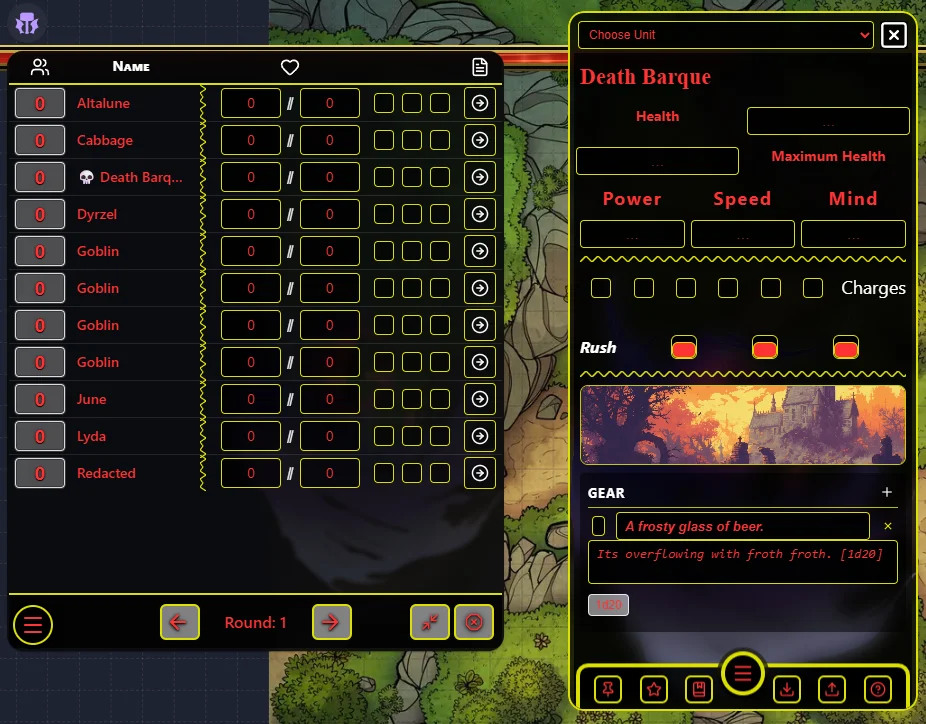
The Initiative Tracker
The Initiative Tracker is the heart of Forge during play. It lives on the Main page and displays all units currently on the OBR scene as a sortable, interactive table.
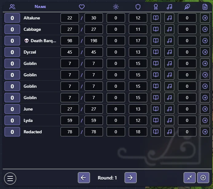
1. The Fixed Columns
Every initiative list always includes two fixed columns at the far left:
| Column | Description |
|---|---|
| Initiative | A numeric value that determines unit order. Click directly on a unit's initiative value to type a new number. A small dice icon next to each row lets you roll initiative for that unit using the configured dice range and any modifier set in Settings. |
| Name | Displays the unit's token thumbnail and its name. The name is color-tinted to match the owning player's assigned color in OBR, giving a quick visual indication of who controls each unit. |
2. Custom Columns
Beyond the fixed columns, the GM can add any number of custom columns — HP, AC, resource pips, checkboxes, status effects, and more. Custom columns are configured using the List Layout builder on the Battle-System website and are applied to the room when a system is loaded via the System page.
3. Interacting with the Tracker
- Open a unit's card — Right-click a token in the scene and choose View [Unit Name], or click the unit row in the tracker if card access is enabled in Settings.
- Set initiative — Click the initiative value on any row and type a number. The table re-sorts automatically.
- Edit attribute columns — Click any value cell to change it directly. If Owner-Only Edit is enabled in Settings, players can only edit values for units they own.
- Effects and Elevation — If Effects or Elevation columns are present, clicking those cells opens their respective popup for that unit.
4. Unit Ownership and Token Colors
Right-clicking a unit's name in the tracker opens an ownership panel showing all players currently connected to the room. Click any player's name to reassign that unit to them. The current owner is labelled with "(current)". You can also use this panel to remove a unit from the list entirely.
Once a unit has an owner, its name in the tracker is rendered with a colored glow matching that player's OBR color — making it immediately clear at a glance who controls what during play. Units owned by the GM, or with no owner, display without color.
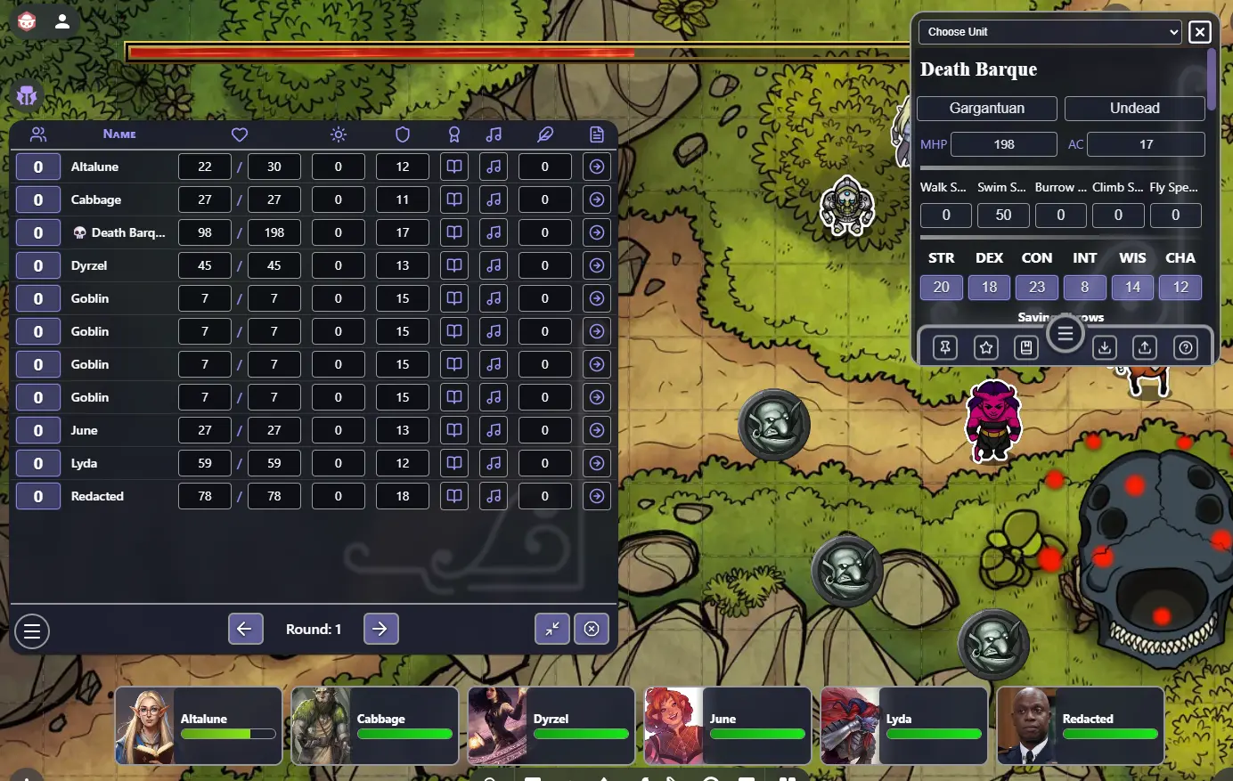
5. Boss Mode
Also accessible from the right-click ownership panel, Boss Mode displays a large HP bar across the top of the OBR viewport for all players. The bar scales to the unit's current and maximum HP and updates in real time.
- Up to 2 bosses can be active at the same time.
- Units in Boss Mode display a 💀 icon before their name in the tracker as a visual indicator.
- Boss Mode can be toggled off at any time from the same panel.
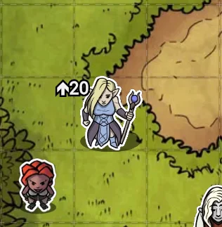
6. The Elevation Column
The Elevation column is included in the default D&D 5e system and lets you track the vertical position of any unit on the map. When you set an elevation value for a unit, Forge automatically creates a text badge directly on that unit's token in the OBR scene:
- Positive values display with an upward arrow: ↑5
- Negative values display with a downward arrow: ↓3
- Setting elevation to 0 removes the badge entirely.
The badge is attached to the token, so it moves with it across the scene. It is rendered on a non-interactive layer so it never interferes with clicking or selecting tokens.
7. The Effects Column
The Effects column lets you attach named status effects to any unit — buffs, debuffs, conditions, spell enhancements, or any other timed state you want to track.
Clicking the effects icon for a unit opens the effects modal. From here you can:
- Add an effect by giving it a name and specifying how many turns or rounds it lasts.
- View active effects — each effect shows its remaining duration.
- Remove effects manually at any time.
Effects count down automatically as turns advance in the tracker. When an effect's duration reaches zero, it expires and is removed. While an effect is active, Forge can display a visual animation on that unit's token in the OBR scene — the animation style is configured via Visual Effect Presets on the System page.
The effects icon in the tracker column shows a count badge when one or more effects are active on that unit.
8. Tracker Controls — Reset and Minimize
The bottom-right corner of the initiative tracker has two control buttons available to the GM:
Reset (⊘ icon) Opens a dialog with three choices for resetting encounter state:
- Reset Round — Resets the round counter back to 1 and clears which units have taken their turn, without changing any initiative values.
- Reset Round & Initiative — Resets the round counter and sets all units' initiative values back to 0.
- Reset Round & Clear List — Resets the round counter and removes all units from the tracker entirely.
Minimize (⤡ icon)
Collapses the initiative list into a compact mode with a smaller footprint on screen. The round counter abbreviates to R: 1 and turn controls switch to simple Previous/Next arrows. Clicking the icon again (now ⤢) restores the full view. This setting is saved per-player, so each person's preference persists independently.
9. Initiative Order and GM Controls
By default, units are ordered from highest initiative to lowest. The GM can change this behaviour from the Settings page:
- Reverse Order — Sort from lowest initiative to highest.
- Popcorn Initiative — At the end of each turn, the active player designates who goes next rather than following a set order.
- Initiative Modifier — Automatically apply an attribute value or formula as a bonus to each initiative roll.
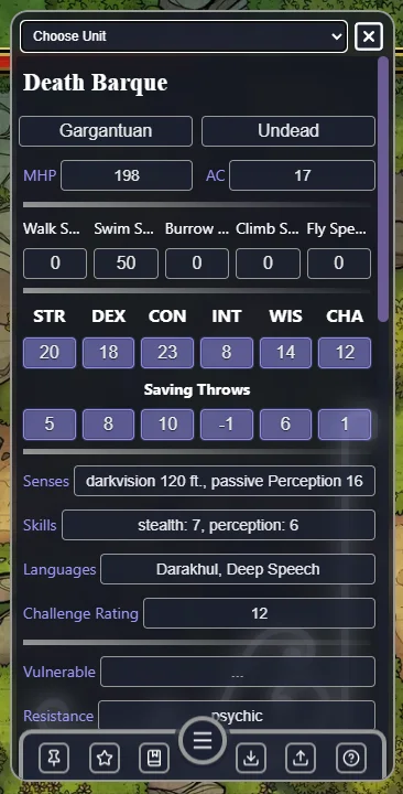
The Unit Card
The Unit Card is a floating popover that shows a full character sheet for a single unit. It can be opened by:
- Right-clicking any token in the scene and selecting View [Unit Name].
- Clicking the unit's row in the initiative tracker (if Show Card Access is enabled in Settings).
The card is intentionally slim and scrollable. Its content — which fields appear, how they are laid out, and what they link to — is determined entirely by the Card Layout configured for the currently loaded game system. All editable fields are live: changes are persisted per unit and apply immediately in the session.
1. Switching Units
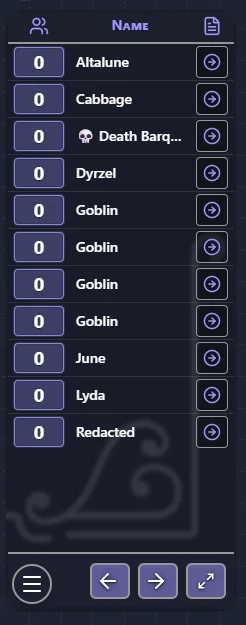
A Choose Unit dropdown at the top of the card lets you swap to any other unit without closing the popover. The dropdown lists all fabricated units available to the current user: players see only their own units, while the GM can switch to any unit in the scene.
Units are sorted alphabetically by display name. Display name priority is: the unit's configured name metadata → the token's text label → the token's item name → "Unknown".
2. Pinning the Card
The Pin button (📌) in the card toolbar toggles between two layout modes:
- Unpinned (default): The card opens as a large centered overlay (350 × 700 px).
- Pinned: The card collapses to a compact 350 × 400 px panel anchored to the top-right corner of the viewport, leaving the rest of the map visible.
Pinned state is preserved in the popover URL so the card remembers your preferred mode after it is closed and reopened.
3. Saving Units to Your Collection
The card toolbar provides two save controls available to the GM:
- Save to Collection (bookmark icon) — Captures a snapshot of the current unit's full stat block and saves it for future use.
- Favorite toggle (star icon) — When active (filled star), the next save to Collection is also marked as a favorite. Favorites appear at the top of the collection list.
If you have a premium account, saves are written to your cloud collection so they are available across rooms. Without a premium account, saves are stored locally in your browser.
Saving the same unit name again updates the existing record rather than creating a duplicate.
4. The Collection Tray
A slide-up tray at the bottom of the card holds your saved unit collection. Open and close it with the menu handle button.
Searching: Type a query into the search field and press Enter (or the search button) to run a live search. The search checks your local collection, your cloud collection (if authorized), and the shared community collection.
Source badges identify where each record came from:
| Badge | Icon | Meaning |
|---|---|---|
| Local | Hard drive | Saved in your browser's local storage |
| My Cloud | Cloud | Saved to your personal cloud collection (premium) |
| Shared | Server | From the shared/default community collection |
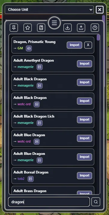
Favorites are indicated with a ❤ before the unit name and always sort before non-favorites within the same source. Source priority order when displaying results: Local → My Cloud → Shared.
Using a collection record: Click Import on any row to load that unit's stat block directly onto the currently selected unit token. Records from Local and My Cloud can also be deleted from the tray. Shared records cannot be deleted.
5. Importing Unit Data
The Import button (download icon) opens a modal where you can paste a JSON payload and apply it to the current unit. The expected format is either:
- A full transfer payload:
{ "name": "...", "author": "...", "metadata": { ... } } - A raw metadata object containing the unit name key directly.
Paste the JSON into the text area and click Import to apply. Validation errors (invalid JSON, missing name, missing metadata) are displayed inline below the text area. On success, all stat values on the open unit card update immediately.
6. The AI Template
Inside the Import modal, the AI Template button copies a ready-to-paste prompt to your clipboard. The prompt contains:
- Instructions for an AI to generate a correctly formatted unit JSON.
- The extension ID and the unit name metadata key.
- A full Attribute Dictionary listing every attribute in the loaded system (ID, name, type, and metadata key).
- An example metadata object showing correct value types for every attribute type (
numb,bool,enum,resource,list). - Example dice chip notation — e.g.
[1d20+@Strength]— embedded in list descriptions.
Paste this template into any AI chat tool and describe the character you want. The AI will return JSON you can paste directly into the Import text area.
7. Exporting Units
The Export button (upload icon) copies the current unit's full stat block to your clipboard as a pretty-printed JSON payload:
{
  "name": "Unit Name",
  "author": "Player Name",
  "metadata": { ... }
}
Only extension-namespaced metadata keys are included — unrelated OBR token data is stripped. This payload can be pasted into the Import modal on any unit in any room, or fed to the AI Template workflow.
8. Dice Chips and Rollable Values
The Help button (? icon) opens a reference modal explaining how dice notation works on card fields.
Rollable Values
Right-click any value on the card to open its field menu. The menu shows the field's name and its BID in brackets (e.g. [Z017]). From this menu you can edit the value directly, or roll it with Advantage or Disadvantage.
Dice Chips in Text
Wrap a formula in square brackets to create a clickable dice chip in any text field. Optional fl() (floor) and ce() (ceil) rounding functions are supported:
Melee attack: [1d20+5] to hit.
Attack: [1d20+fl(@Strength/2)]
Referencing Attributes in Formulas
Reference a stat by its BID with @BID, or by its attribute name with @NAME (replace spaces with underscores):
Damage: [2d8+@Z017]
Damage: [2d8+@Strength]
The Party View
The Party page is available to all users, both GM and players. It shows the units assigned to each player, rendered as condensed character cards.
For players without full initiative tracker access (when the GM has not enabled Show Player View), the Party page is their primary interface with Forge.
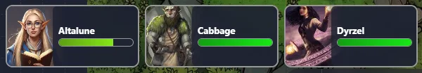
1. Portraits
Each party member's card shows a portrait pulled from the unit's token image in the OBR scene. If you want a different image (for example, a character portrait instead of a top-down token), set a Portrait URL override per unit. When an override is set, both images are shown: the original token image as a small background thumbnail and the portrait URL as a larger foreground overlay.
2. HP Display
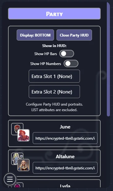
The GM can configure how hit points are shown on party cards. The two options are mutually exclusive:
- Show HP Bars — Displays a visual bar that fills relative to current HP vs maximum HP.
- Show HP Numbers — Displays the current and maximum HP as numbers (e.g.
42 / 55).
Both options require HP BIDs to be configured on the System page. If neither option is enabled, HP is not shown on party cards.
3. Extra Attribute Slots
In addition to HP, the GM can expose two additional attributes on each party card using the Extra Slot 1 and Extra Slot 2 dropdowns. Any Text, Number, or True/False attribute from the current game system can be selected. List-type attributes are excluded.
If the same attribute is selected for both slots, the second slot automatically clears. Either slot can be left empty (set to "None").
4. Save and Load Party
The Party page includes Save Party and Load Party controls between the Party HUD controls and the portrait override card list.
- Save Party stores the current Party tokens to the user's browser
localStorage. - Load Party inserts those saved tokens back into the current scene.
- If a saved token ID already exists in the scene, the existing token is removed first, then replaced by the saved version.
- Loaded tokens are positioned in the viewer's viewport for easy location.
A status line under the buttons shows when the party was last saved:
- Last saved: {TimeStamp} If a save exists, the timestamp from when it was saved will be displayed.
- No save available. Means no save can be found.
Note: Party saves are local to the current browser/device profile. They are not synchronized to room metadata or shared automatically with other users.
5. The Party HUD
The GM can enable a floating Party HUD — a detached compact panel that hovers over the OBR viewport independently of the main Forge panel. It can be pinned to any edge of the screen and shows each party member's portrait, HP state, and any configured extra attributes at a glance. The HUD is useful for keeping an eye on the party during combat without switching back to the Party page.
The System Page
The System page (GM only) is where you control which game system Forge uses in the current room.
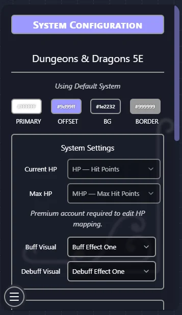
1. Current System Info
The page shows the currently loaded system's name, the date it was imported, and color swatches for its four theme colors. By default, the base D&D 5e game system is loaded.
2. Importing a System by Share ID
If a system has been built and published on the Battle-System website, a Share ID is generated for it. Enter that ID here to load the system into your room:
- Type or paste the Share ID into the Share ID field.
- Click Import System.
- Forge fetches the system's attributes, card layout, list layout, and theme — then applies them immediately. All units in the room begin using the new system's display.
- This is disabled unless you connect your account in the Settings.
Here is an example of some random System/Theme you could throw together!
3. Loading the Default System
Click Load Default System to restore the built-in D&D 5e system at any time. This is the same system that loads automatically when Forge is first added to a room.
4. HP Mapping
The HP Mapping section tells Forge which BIDs in your system represent current and maximum HP. This powers:
- The HP bar rendered on unit tokens (when enabled in Settings).
- The death effect animation (when HP reaches zero or below).
- HP-aware context menu shortcuts.
Select the correct BIDs from the dropdowns. For the default D&D 5e system these are pre-filled automatically.
5. Visual Effect Presets
Choose the animation style used for buff and debuff effects. These animations play on a unit's token when status effects are applied via the Effects column in the tracker.
6. Local Backups
Each time you import a system, Forge saves a local backup so you can restore it without re-entering a Share ID. The backup list shows each saved system by name and date. Click Restore to re-apply a backup, or Delete to remove it.
Extension Settings
The Settings page is accessible to the GM only and controls how the extension behaves for everyone in the room.
List Controls
| Setting | Description |
|---|---|
| Popcorn Initiative | Each player's turn ends by designating who goes next, rather than following a fixed order. |
| Reverse Initiative | Sort the tracker from lowest initiative to highest. |
| Dice Range | The die size used when rolling initiative (D4, D6, D8, D10, D12, D20, D100). |
| Show Card Access | Allow clicking a unit row in the tracker to open its Unit Card. |
| Initiative Modifier BID | An attribute BID whose value is automatically added to each initiative roll. |
| Initiative Modifier Expression | A formula applied on top of the BID modifier (default: @STAT). |
Player Controls
| Setting | Description |
|---|---|
| Show Player View | Allow players to see the full initiative tracker (not just the Party page). |
| Show Non-Party Units | Include units not assigned to any player in the player-visible tracker. |
| Show HP Numbers | Display numeric HP values in the tracker for players. |
| Owner-Only Edit | Only the player who owns a unit can edit its stats on the Unit Card. |
| Player Context Menu — Modify | Show the "Modify Unit" option in the right-click menu for players. |
| Player Context Menu — View | Show the "View Unit" option in the right-click menu for players. |
Game Controls
| Setting | Description |
|---|---|
| Show HP Bars | Render a live HP bar on each unit's token, sized relative to current/max HP. |
| HP Bar Orientation | Which edge of the token the HP bar appears on (Top, Bottom, Left, Right). |
| Show HP Numbers on Tokens | Display the numeric current/max HP directly on the token as well. |
| Death Effect | Play a visual death animation when a unit's HP drops to zero or below. |
| Show Names | Display unit names as labels above or below tokens on the map. |
| Turn Effect | Apply a visual highlight to the token whose turn it currently is. |
| Descriptive Duplicates | Automatically append a unique adjective to duplicate token names to tell them apart. |
Dice Controls
Forge integrates with several other Owlbear Rodeo dice extensions. These settings control which extension handles dice rolls when initiative is rolled or dice expressions are evaluated. Only one integration should be active at a time.
| Setting | Description |
|---|---|
| Rumble! | Route dice rolls through the Rumble! OBR extension. If Rumble! is installed in the room, Forge will send its rolls there so they appear in Rumble!'s chat log, visible to all players. |
| Bones! | Route dice rolls through the Bones! OBR extension. Bones! displays a 3D dice overlay and shows a notification popup in the bottom-left for everyone in the room. |
| Dice+ | Route dice rolls through the Dice+ OBR extension. Dice+ handles targeting (everyone / self / GM only) and its own result display. |
| Text-Based Rolls | Skip all 3D dice extensions and instead show results as a text notification popup at the top of the OBR screen. A fast, no-frills option with no external extension required. |
| OBR Notification | When using Text-Based Rolls, also send an OBR system notification popup with the result. |
| Notification to All | When OBR Notification is on, show the popup to all players — not just the roller. |
| Discord Logging | Send dice roll results to a Discord channel via webhook URL. Note: this does not work when Bones! is active, as the roll is handled entirely by the Bones! extension. |
| Discord Webhook URL | The webhook URL for the Discord channel that receives dice roll logs. |
Unit Collection
The Unit Collection is a personal library of saved unit stat blocks. Use Export to save your current units to a file, and Import to restore from a previous export. This lets you preserve unit data across rooms or share full stat blocks with other GMs.
Diagnostics
| Setting | Description |
|---|---|
| Enable Console Log | Enables verbose debug logging to the browser's developer console. Useful for diagnosing unexpected behaviour or reporting issues. Disabled by default and has no effect on gameplay. |
Building Custom Systems — Battle-System Website
The sections below document the Battle-System website, a companion tool that lets you design fully custom game systems for use in Forge. The website is entirely separate from the Forge extension — Forge works out of the box without it, using the included D&D 5e system.
To use a custom system in Forge:
- Build and publish it on the Battle-System website.
- Copy the generated Share ID.
- In Forge → System page → paste the Share ID → Import System.
Premium features on the Battle-System website (multiple custom systems, Share IDs, advanced import/export) are available to Patreon supporters.
Stats Page — Managing Attributes
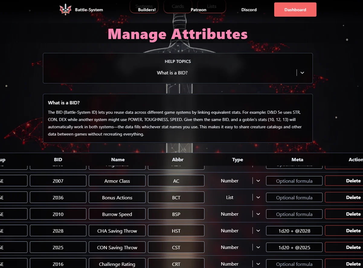
The Stats page is where all of your game's data fields live. Before you can display anything on a card or list, you need to define the attributes you want to track.
1. What is an Attribute?
An attribute is a single piece of data that belongs to a unit. Every unit in Owlbear Rodeo can store values for every attribute you define. Examples:
- A Text attribute called "Race" to store a unit's species.
- A Number attribute called "Strength" to hold an integer stat.
- A True/False attribute called "Proficient" to toggle whether a skill applies.
- A Resource attribute called "Hit Points" to track current HP out of maximum.
- A Derived attribute called "Strength Modifier" that auto-calculates from Strength.
Attributes are shared across all of your game systems, but each system only uses the attributes you explicitly assign to it.
2. The Attribute Table Columns
The Stats page shows a table with one row per attribute. Each row has the following columns:
| Column | Description |
|---|---|
| Group | An optional organizer tag. Give all attributes for one game or category the same group name so you can find and filter them easily. Does not affect gameplay — purely for your organization. |
| BID | The Battle-System ID. A short, unique code (up to 4 uppercase alphanumeric characters) that is the true identifier for this attribute's stored value. See the BID section below for a full explanation. |
| Name | The full display name of the attribute, used when there is enough space (e.g. "Strength"). |
| Abbr | A shortened version of the Name, used in tighter layouts (e.g. "STR"). |
| Type | The data type this attribute stores. Determines what controls appear for it in-game and what components can use it. |
| META | An optional formula field. Available for Text, Number, and Derived types. Supports dice rolls, math, and cross-attribute references. |
| Actions | A delete button. Click once to arm the delete, click a second time to confirm. This double-confirmation prevents accidental deletions. |
You can also sort the table by clicking on the Group, BID, Name, or Type column headers. Clicking the same header twice reverses the sort direction.
3. Adding an Attribute
Click the + Add Attribute button at the bottom of the table. A new blank row will appear at the bottom. The cursor will jump to the new row's BID field automatically.
Fill in at minimum:
- A BID (required, must be unique, 1–4 uppercase letters/numbers).
- A Name (required).
- A Type (defaults to Text if left unchanged).
All other fields are optional. The row will be validated in real-time — if there are errors, fields will be highlighted and a save will be blocked until they are resolved.
Note: Your account has a maximum attribute count. If you hit the limit, the Add Attribute button will show a toast message and refuse to add another row.
4. Editing an Attribute
All fields in the table are directly editable inline. Click into any cell to start editing it. Changes are tracked live, and the page will show a save indicator when there are unsaved changes.
When you change an attribute's Type, the META field and any type-specific configuration (like Enum options or Resource defaults) is automatically reset and normalized for the new type. This prevents leftover data from a previous type from interfering.
BID validation rules:
- Must be 1–4 characters.
- Only uppercase letters (A–Z) and digits (0–9) are allowed.
- Must be unique across all of your attributes. Duplicate BIDs will both be highlighted with an error.
Name validation:
- Cannot be left blank.
META/Formula validation:
- If the formula is not syntactically valid, the field will be highlighted with an "Invalid formula" error. A save will still be possible for the row, but you should fix the formula before deploying the system.
5. Deleting an Attribute
Click the red delete icon in the Actions column of the attribute row you want to remove. Because deletion is destructive, a second click is required to confirm. If you click elsewhere in between, the confirmation resets and you would need to click the delete button twice again.
Warning: Deleting an attribute removes it from all systems and layouts. Any component or column in your card/list layouts that referenced that BID will become invalid. You will need to update those layouts after deletion.
6. The Seven Attribute Types
The Type field determines what kind of data this attribute holds, how it behaves in-game, and which layout components can reference it.
Text
Stores freeform written input — names, titles, notes, tags, descriptions, or any value a player types directly as words. Text attributes can optionally use a formula to derive a read-only text result from other attributes if desired, but most of the time they are plain free-entry fields.
Best Used For: Race, Class, Background, Notes, Title, Alignment, Languages.
Number
Stores a numeric value — integers or decimals. These are the workhorses of most stat systems. Players type in a number and it gets stored. Number attributes work well with formulas, dice expressions, and any calculated stat.
Best Used For: Strength, Armor Class, Speed, Level, Experience Points, any stat expressed as a number.
True / False
Stores a simple on/off boolean state. In layouts these usually appear as checkboxes or toggle sliders — the player either checks it or they don't. No text, no numbers.
Best Used For: Proficient, Concentrating, Equipped, Inspired, Marked, Dead, Conditions/Status Effects.
List
Stores a collection of entries rather than a single value. Each entry has a Name and a Description field. Players can add, remove, and rename entries. Use this for anything that repeats.
Best Used For: Actions, Special Abilities, Spells, Equipment, Inventory, Feats, Traits.
Select (Enum)
Stores one value chosen from a predefined set of options. When you define a Select attribute you provide the list of valid choices in the META field (as a comma-separated list). In-game the player picks from a dropdown.
You can optionally enable Allow Custom on an Enum attribute, which permits players to type in a value that isn't on the predefined list.
Best Used For: Class, Subclass, Damage Type, Stance, Weapon Type, Alignment, any field where only specific values are valid.
META Configuration:
- Enter all allowed options as a comma-separated list:
Fire, Ice, Lightning, Poison, Acid - Check "Allow Custom" if players should be able to type in their own value too.
Derived
Calculates its value automatically from a formula. The value is read-only in-game — players cannot edit it directly. The formula is evaluated each time the card refreshes and can reference other attributes by their BID using the @BID syntax, and can include dice notation.
Best Used For: Ability Score Modifiers, Passive Perception, Proficiency Bonus, Attack Bonus, Save DC, any value that should auto-update from other stats.
META / Formula (Required for Derived): Derived attributes require a valid formula in the META field. See the META Formula section below for full syntax.
Resource
Tracks two values together: a Current value and a Maximum value. Most commonly shown as 8 / 10. Resource attributes can optionally display as filled/empty pips (dots) instead of numbers, which is useful for limited-use abilities, spell slots, or any resource with a small cap.
META configuration for Resource:
- Default Current — the starting value for the current resource (e.g., 10).
- Default Max — the starting value for the maximum resource (e.g., 10).
- Show Pips — toggle pip display mode instead of numbers.
- Pip Cap — maximum number of pips to display (up to 15). Pips will scale to fill/empty proportionally.
Best Used For: Hit Points, Mana, Stamina, Spell Slots per Level, Channel Divinity, Lucky Points, Ammo, Charge Tokens.
7. Understanding BIDs
The BID (Battle-System ID) is the unique code that identifies where a piece of data is stored for a unit.
The key concept is that different game systems can use the same BID to both access the same pool of data even with different names and terminology. This is what makes Forge system-agnostic.
Example: Suppose you build both a D&D system and a Cyberpunk system.
- Your D&D system has an attribute called "Strength" with BID
STR. - Your Cyberpunk system has an attribute called "Body" with BID
STR.
When a goblin has a STR value of 10, both systems see the same number — they read from the same BID. If you switch a unit from one system to the other, the data carries over because the BID matches.
This makes it easy to:
- Share creature catalogs between games.
- Port a stat block from one system to another without re-entering everything.
- Let collaborators contribute attributes that slot into your existing BID structure.
BID rules:
- 1 to 4 characters, uppercase letters and digits only (e.g.
HP,STR1,LVL,AC). - Must be unique in your account — no two attributes can share the same BID.
- BIDs are case-insensitive internally; they are always stored as uppercase.
8. The META Formula Field
The META field appears for Text, Number, and Derived attribute types, and it enables powerful dynamic calculations.
A properly written formula is evaluated in-game to produce a computed result. For Derived attributes this result replaces any direct user input (the field is read-only). For Text and Number attributes it provides an optional computed value alongside a still-editable input.
Formula Syntax:
Reference another attribute by its BID using the @ prefix:
@STR
@LVL + @STR
Standard math operators are supported: +, -, *, /
Functions are supported: floor, ceil, round, max, min, abs
floor(@STR / 2) - 5
ceil(@LVL / 4) + 1
max(@STR, @DEX)
abs(@DEBT)
Dice notation is also supported:
| Notation | Meaning |
|---|---|
1d20 |
Roll one 20-sided die |
3d6 |
Roll three 6-sided dice, sum them |
4d6kh3 |
Roll four d6, keep highest 3 |
2d20kl1 |
Roll two d20, keep lowest 1 (Disadvantage) |
d4, d6, d8, d10, d12, d20, d100 |
Supported die sizes |
Example formulas:
1d20 + @DEX + 2          — Attack roll with DEX modifier and +2 bonus
ceil(@LVL / 4) + 1       — Proficiency bonus by level
(1d8 + @STR) * 2         — Critical damage
floor((@STR - 10) / 2)   — D&D Strength modifier
Note: Parentheses are supported for grouping and order of operations, same as standard math.
9. Autosave
The Stats page tracks whether you have unsaved changes. If you leave changes sitting for 1 minute without manually saving, the page will attempt to save automatically. You can also click the Save button at any time.
A save will be blocked if there are any validation errors (missing BIDs, duplicate BIDs, missing Names, or invalid formulas). Fix those errors first and then save.
10. The Documentation Panel
At the top of the Stats page you will find a small help panel. Use the dropdown selector to pick a topic, and an explanation of that topic will appear below it.
Available topics:
- What is a BID? — Explains the BID system and cross-system compatibility.
- What is META? — Explains formula syntax, dice notation, and operator support.
- Text Attributes — Overview of the Text type.
- Number Attributes — Overview of the Number type.
- True / False Attributes — Overview of the Bool type.
- List Attributes — Overview of the List type.
- Select Attributes — Overview of the Enum type.
- Derived Attributes — Overview of the Derived type.
- Resource Attributes — Overview of the Resource type.
Systems Page — Managing Game Systems
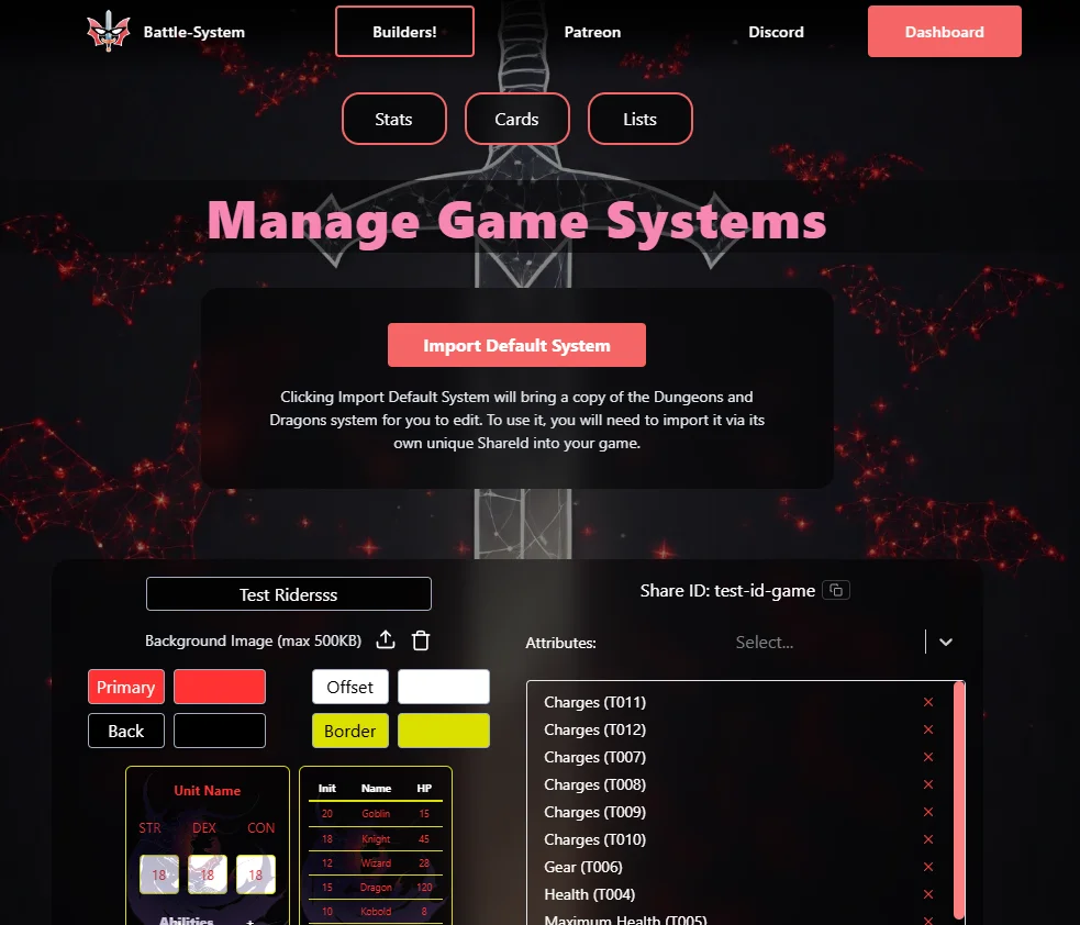
The Systems page is where you create and configure Game Systems. A system is the container that ties attributes together and carries your visual theme. It is what players and GMs select when playing in Owlbear Rodeo.
1. What is a Game System?
A Game System is a named configuration that:
- Selects a specific subset of your attributes to use.
- Carries a visual theme (colors, background art).
- Stores the card layout and list layout you designed for it.
- Has a Share ID so others can import it.
You can have multiple systems — one for D&D, one for Pathfinder, one for your homebrew setting, or different sub-systems for different campaign types. Each system is independent.
Note: Your Forge account tier determines the maximum number of systems you can have at once. The extension includes a base tier by default; expanded tiers are available to Battle-System Patreon supporters.
2. Creating a System
Click the + New System button. A draft system card will appear immediately with the name "New System". This is an unsaved draft — it lives only in your browser until you click Save.
You can also click Import Default System to add another copy of the built-in D&D 5e system (see below for more details).
3. Naming a System
Click into the Name field on a system card and type the name you want. The name is required before you can save the system.
4. Theming a System
Each system has four color values that control how all cards and lists in that system look:
| Color | What it Controls |
|---|---|
| Primary | Main text color, input values, foreground elements |
| Offset | Label color, accent text, secondary elements |
| Background | The background fill of the card/list container |
| Border | The border/line color used on inputs, dividers, and separators |
Each color has a color swatch and a color picker button next to it. Click the picker (the colored rectangle) to open a compact palette picker. Click anywhere outside the picker to close it.
The system preview at the right of the card updates live as you change colors.
Tip: Choose high contrast between Primary and Background for readability. The Offset color works well at a mid-tone between those two — it is used for label text, which should be readable but visually secondary to the value text.
5. Adding a Background Image
Each system can have a background image that appears in the bottom-right corner of cards and lists. The image must be under 500KB and use a standard format (PNG, JPG, or WebP).
To upload:
- Click Upload Image (the upload icon button) on the system card.
- Choose your file from the file picker.
- The image is uploaded to cloud storage immediately and the URL is saved to your system.
To remove:
- Click Remove Image (the trash icon button) next to the current image.
- This deletes the file from storage and clears the URL from your system.
Note: The image URL is saved immediately after upload, so no manual save is needed.
6. Assigning Attributes to a System
Each system has an Attributes section with a dropdown selector. To add an attribute to the system:
- Click the Attributes dropdown.
- Search for or select the attribute you want to add (attributes are shown by Name and BID).
- The attribute will appear as a tag below the dropdown.
To remove an attribute from a system, click the X on its tag in the attribute list.
Important: Only attributes that are assigned to a system will be available for use when designing that system's card and list layouts. Assign all attributes you want to appear in the layouts before going to the Cards or Lists pages.
You can also reorder attributes by dragging their tags if you want a specific order, though the order used in layouts is fully controlled on the Cards and Lists pages.
7. Share IDs
A Share ID is a short, generated code that uniquely identifies your system so other users can import it. It acts like a public link to your system's data snapshot.
Share IDs are visible on each system card, below the theme controls. If you have a Share ID, a Copy button appears next to it — click it to instantly copy the ID to your clipboard. The button will briefly show a checkmark to confirm the copy.
Account Tier Notes:
- Share IDs are a Premium feature of the Forge extension. Accounts on the base tier will see "Share ID: Premium Feature" instead of a generated ID.
- Premium accounts (Battle-System Patreon supporters) receive a Share ID automatically when a system is created or saved for the first time.
8. Importing a System by Share ID
If someone shares their Share ID with you, you can import a full copy of their system (including all its attributes, theme, card layout, and list layout).
To import a system by Share ID, you would use the import function in Owlbear Rodeo's Forge extension directly (not on this web page). The Share ID is the value you enter to trigger an import in-game.
When a system is imported:
- All attributes from the source system are copied into your account with new, conflict-free BIDs.
- The new system gets its own ID and (if you are Premium) a new Share ID.
- Formulas that reference BIDs are automatically remapped to the new BIDs so they continue to work.
9. The Default System
Forge ships with a fully pre-built Dungeons and Dragons 5e system built in. It includes attributes for ability scores, modifiers, skills, saving throws, HP, AC, speed, and more — along with pre-configured card and list layouts that are ready to use immediately with no setup required.
If you have already used or deleted the default system and want to add another copy, click the Import Default System button at the top of the Systems page.
The import button will be disabled in any of these situations:
- You have already reached your maximum system count for your account tier.
- Importing would exceed your maximum attribute count. (The system needs a specific number of attributes; if your account doesn't have room, the button will explain this and tell you how many slots you need to free up.)
- The import is currently in progress.
To use the default system, go into your game in Owlbear Rodeo and select it from the system picker in Forge.
Note: The imported system arrives named "[System Name] (Imported)" so you can distinguish it from any other system you already had with the same name. You can rename it freely afterward.
10. System Preview Thumbnails
Each system card shows two small live previews: one for the Card layout and one for the List layout. These render at small scale using the current theme colors and background image. They are not interactive — just a quick visual reference.
If you have not built a layout yet for a system those preview areas will show an empty state.
11. Saving and Deleting Systems
Saving: Click the Save button on a system card. This commits all pending changes: name, theme colors, background URL, and attribute assignments. If the system is a new draft, it will be created in the database at this point and get a Share ID (if your account tier supports it).
Deleting: Click the Delete System button. A confirmation dialog will appear. Confirm to permanently delete the system. This does not delete the attributes that were assigned to it — only the system container and its layouts.
Cards Page — Building Card Layouts
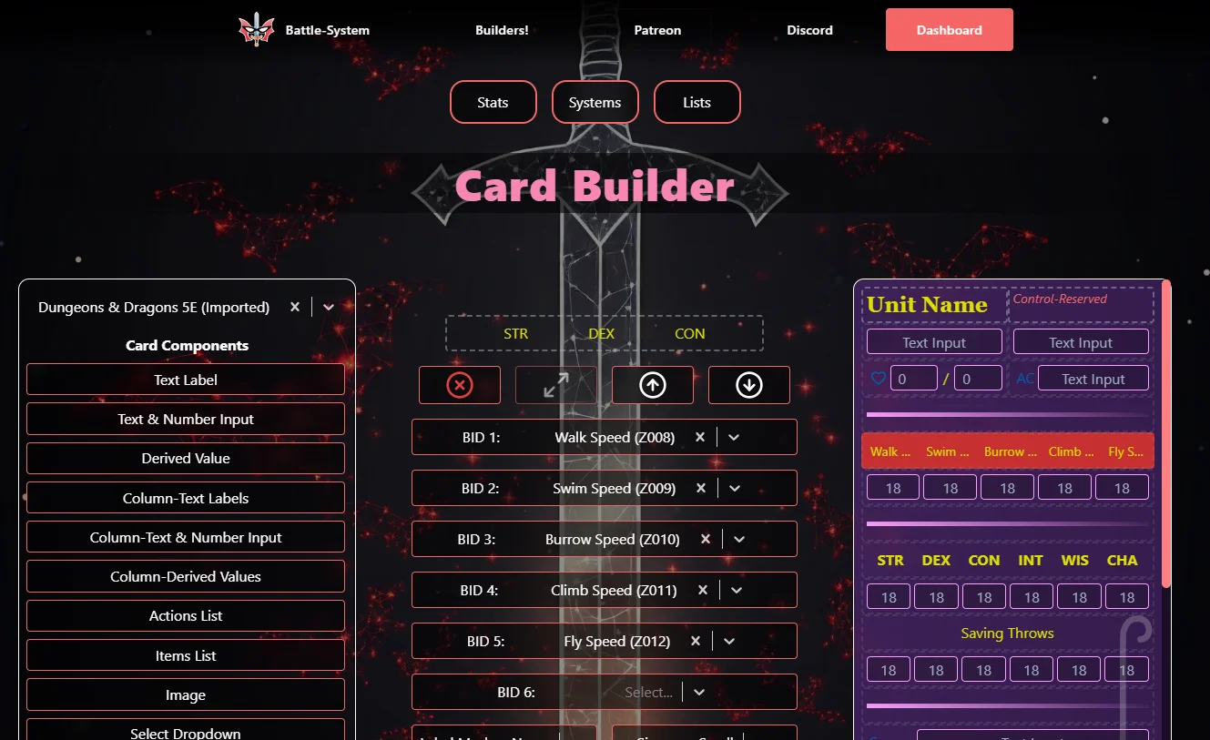
The Cards page is where you design the visual unit card — the sheet that appears when a player opens a unit's details in Owlbear Rodeo. You are building a visual layout by stacking components in rows.
1. What is a Card Layout?
A card layout is a vertical sequence of rows. Each row contains one or two components. Components are the building blocks: input fields, labels, lists, checkboxes, images, and more. You pick the components you want, configure them to reference your attributes, and arrange them in the order you want them to appear.
The card renders at a fixed width of 350px with a scrollable height. It is displayed in Owlbear Rodeo when a player interacts with a unit.
2. Selecting a System
Before you can design a card layout, you must select which game system you are building for. Use the Select a Game System dropdown at the top of the sidebar (on desktop) or at the top of the page (on mobile).
The dropdown will glow red and pulse until you make a selection — this is a visual reminder that nothing can be done without a system selected. Once you pick a system, the attribute list for that system becomes available to all component configuration panels.
Note: If you have unsaved changes to a card layout and navigate away or select a different system, your browser will warn you before leaving.
3. Adding Components
On the left sidebar (desktop) or the scrollable carousel (mobile), you will see a list of all available card component types. Click a component type to select it (it will highlight). Then click the + (Add) button in the configuration area to place it into your layout.
The new component will appear at the bottom of the preview (or in the last row if there is room for a second half-size component).
4. Selecting a Placed Component
Click on any component already placed in the layout preview to select it. When a component is selected:
- It highlights in the preview.
- The configuration panel on the right updates to show that component's specific settings.
- The - (Remove) button becomes active.
- The Move Up / Move Down arrows become active.
To go back to the "new component" mode (for adding a new component), click the component type in the sidebar again with nothing selected.
5. Half-Size vs. Full-Size Components
Components can be either half-size (taking up half the row width — two fit per row) or full-size (spanning the full row width — one per row).
- When you are about to add a new component, toggle the Resize icon button to switch between half and full size.
- Once a component is placed its size is locked. You cannot resize a placed component (you would need to remove and re-add it at the correct size).
- Action Lists and Item Lists are always full-size — they need the full width to display their content adequately and cannot be placed at half size.
Tip: Half-size components placed in the same row will be side by side. This is ideal for pairing Column-Text Labels with Column-Text & Number Inputs, or putting two quick stats next to each other.
6. Moving Components
With a component selected in the preview, use the Move Up and Move Down arrow buttons in the configuration area to reposition it in the layout. Moving a component shifts it to the adjacent row above or below.
7. Removing a Component
With a component selected in the preview, click the - (Remove) button (the red X-circle icon) to delete it from the layout.
8. Saving a Layout
When any changes are made to the layout, the Save Layout button appears (on desktop it is in the bottom of the left sidebar; on mobile it appears above the preview). Click it to commit the layout to your system.
The layout is validated before saving. If any component has an invalid configuration (missing attribute reference, bad checkboxcount, etc.) the save will be blocked and an error will be shown. Fix the configuration issue and try again.
Once saved, the layout will be used in-game whenever that system is selected for a unit.
Note: Your browser will warn you if you try to navigate away with unsaved layout changes.
9. All Card Components
Below is a detailed description of every component available in the Card Builder.
Text Label
What it does: Displays a piece of static or attribute-bound text as a header, title, or label. This field is not editable by players in-game — it is purely informational or decorative.
Common use: Section headings ("Combat Stats", "Abilities", "Traits"), unit type labels, flavor text, sub-headers between groups of stats.
Configuration Options:
| Option | Description |
|---|---|
| Attribute | Which attribute's value to display as the label text. If blank, you can use it as freeform decoration. |
| Bold | Embolden the text. |
| Italic | Italicize the text. |
| Size | Small, Medium, or Large font size. |
| Align | Left, Center, or Right text alignment. |
| Stretch | Applies wide letter-spacing for a spread-out look. |
| Use Abbr | If checked, uses the attribute's Abbreviation instead of its full Name. |
Text & Number Input
What it does: A single editable input field linked to a Text or Number attribute. Players can type directly into this field in-game and their input is saved.
Common use: Strength score, Armor Class, Speed, Proficiency Bonus, single-value stats of any kind.
Configuration Options:
| Option | Description |
|---|---|
| Attribute | Which Text or Number attribute this input saves to. |
| Label | How to display the label: by full Name, Abbreviation, an Icon, or Blank (no label). |
| Icon | When Label is set to Icon, pick the icon to show. |
| Label Position | Show the label on the Left or Right side of the input. |
| Bold | Embolden the label text. |
| Italic | Italicize the label text. |
| Stretch | Wide letter-spacing on the label. |
| Size | Small, Medium, or Large label font size. |
| Align | Left, Center, or Right alignment of the input value. |
Derived Value
What it does: Displays the computed result of a Derived attribute formula. The field is read-only — the value auto-calculates. In the builder it shows ƒ(x) as a placeholder.
Common use: Strength Modifier, Passive Perception, Proficiency Bonus, Attack Bonus, Spell Save DC — anything calculated from other stats.
Configuration Options:
| Option | Description |
|---|---|
| Attribute | Which Derived attribute to display. |
| Label | Name, Abbreviation, Icon, or Blank. |
| Icon | Icon to show when Label mode is Icon. |
| Label Position | Left or Right. |
| Bold / Italic / Stretch / Size | Same text styling options as other components. |
Column-Text Labels
What it does: Displays a row of up to 3 (half-size) or 6 (full-size) static attribute name labels, evenly spaced in a horizontal column. No editable inputs — just the labels. Designed to sit above Column-Text & Number Inputs so columns are labeled.
Common use: Ability score headers above a row of values, skill headers, any situation where you want a labeled grid of stats.
Configuration Options:
| Option | Description |
|---|---|
| BID 1–6 | Attributes whose names/abbrs will be shown as column labels. |
| Label Mode | Show attribute full Name or Abbreviation. |
| Bold / Italic / Stretch / Size | Text styling options. |
Column-Text & Number Input
What it does: A row of up to 3 (half-size) or 6 (full-size) editable input fields, evenly spaced in columns. Each input maps to a different attribute. Use in tandem with Column-Text Labels above it for a labeled stat grid.
Common use: The classic D&D stat block — 6 ability scores in a row, each with its own input.
Configuration Options:
| Option | Description |
|---|---|
| BID 1–6 | Which Text or Number attributes each column input maps to. |
| Label Mode | Show full Name or Abbreviation above each input. |
| Bold / Italic / Stretch / Size | Text styling options for the inline labels. |
Column-Derived Values
What it does: A row of up to 3 (half-size) or 6 (full-size) read-only derived value displays. Functions identically to Column-Text & Number Input, but all values are computed from Derived attributes and cannot be edited directly.
Common use: A row of auto-calculated ability score modifiers below the score inputs.
Configuration Options:
| Option | Description |
|---|---|
| BID 1–6 | Which Derived attributes to display in each column slot. |
| Label Mode | Name or Abbreviation. |
| Bold / Italic / Stretch / Size | Text styling options. |
Actions List
What it does: Links to a List-type attribute and renders it as an expandable action block. Each entry has a Title and a Description. Players can add new entries, edit existing ones, or remove them. Optionally adds checkboxes per entry (e.g. for tracking uses).
This component is always full-size.
Common use: Actions, Bonus Actions, Reactions, Special Attacks, Traits, Passive Abilities.
Configuration Options:
| Option | Description |
|---|---|
| List Attribute | Which List-type attribute this block renders. |
| Checkbox Count | 0–N checkboxes shown per entry (for tracking limited uses). |
Items List
What it does: Links to a List-type attribute and renders it as an inventory/item block. Each entry has a Name and a Description, and also an in-use toggle that players can flip to mark whether the item is active/equipped.
This component is always full-size.
Common use: Equipment, Inventory, Spell Slots per level, Consumables, Ongoing Conditions.
Configuration Options:
| Option | Description |
|---|---|
| List Attribute | Which List-type attribute this block renders. |
Image
What it does: Displays a single uploaded image inside the card. You configure its footprint by setting its width (1 or 2 columns) and height (1–6 rows, where each row is approximately 40px tall). The image scales to fill the configured space.
Common use: Unit portrait, ability art, map reference, decorative artwork.
Configuration Options:
| Option | Description |
|---|---|
| Image | Drag and drop or click to upload an image file (max 500KB). The image is stored in cloud storage. |
| Width (Columns) | 1 (half) or 2 (full) columns wide. |
| Height (Rows) | 1–6 rows tall. |
Select Dropdown
What it does: Links to a Select (Enum)-type attribute and renders it as a dropdown. The available choices come from the options defined on the attribute itself. Players pick one option from the list in-game.
Common use: Class, Subclass, Damage Resistance type, Stance, Species, any capped-choice field.
Configuration Options:
| Option | Description |
|---|---|
| Attribute | Which Enum attribute to link. |
| Label | Name, Abbreviation, Icon, or Blank. |
| Icon | Icon to show when in Icon mode. |
| Label Position | Left or Right. |
| Bold / Italic / Stretch / Size | Text styling. |
Resource
What it does: Links to a Resource-type attribute and displays current/max values side by side (e.g. 8 / 10). Can optionally switch to pip display mode, where filled and empty dots represent the resource state.
Common use: Hit Points, Mana, Stamina, Spell Slots, Sorcery Points, Ki, any trackable pool.
Configuration Options:
| Option | Description |
|---|---|
| Attribute | Which Resource attribute to link. |
| Label | Name, Abbreviation, Icon, or Blank. |
| Icon | Icon when in Icon mode. |
| Label Position | Left or Right. |
| Pips | Toggle whether to display as pips or numeric current/max values. |
| Bold / Italic / Stretch / Size | Text styling. |
Checkbox
What it does: One or more toggle inputs (checkboxes or sliders) that each link to a True/False attribute. A single Checkbox component can contain up to 3 checkboxes (half-size) or 6 checkboxes (full-size), each independently linked to a different attribute. Players can check/uncheck them in-game.
Common use: Conditions (Prone, Stunned, Poisoned), Concentration, Proficiency, Inspiration, multi-use trackers with one checkbox per charge.
Configuration Options:
| Option | Description |
|---|---|
| BID 1–6 | Each BID links one checkbox/slider to one True/False attribute. |
| Checkbox Count | How many checkboxes to show (1–3 for half-size, 1–6 for full-size). |
| Input Type | Checkbox (square tick) or Slider (toggle switch). |
| Label | Name, Abbreviation, Icon, or Blank (label is derived from BID 1's attribute name). |
| Icon | Icon when label mode is Icon. |
| Label Position | Left or Right. |
| Bold / Italic / Stretch / Size | Text styling for the label. |
Line-Break
What it does: A simple horizontal dividing line drawn across the full width of the card. No configuration options — just a visual separator.
Common use: Separating card sections (e.g. between "Core Stats" and "Combat Stats").
Spacer
What it does: An invisible gap that adds vertical space between other components. No visual output — just whitespace.
Common use: Adding breathing room between sections, creating visual groupings without a visible line.
10. Label Modes
Most components that link to an attribute have a Label configuration option. This controls what text (if any) appears as the label alongside the input or value. The four modes are:
| Mode | Behavior |
|---|---|
| Name | Uses the attribute's full Name (e.g. "Strength") |
| Abbr. | Uses the attribute's Abbreviation (e.g. "STR") |
| Icon | Shows an icon instead of text (see below) |
| Blank | No label is shown at all |
Pick Abbr. in tighter column layouts where space is limited. Pick Name for wider components where you want clarity. Pick Icon for a clean visual indicator or game-specific style.
11. Using Icons as Labels
When Label mode is set to Icon, an additional Icon dropdown appears. You can pick from a library of over 40 icons to use in place of the text label. Icons render as scalable vector graphics that inherit the label's color from your system theme.
Available icons include: Anchor, Aperture, Award, Battery Charging, Book, Calendar, Clock, Cloud Lightning, Compass, Dollar Sign, Feather, Eye, Heart, Moon, Music, Shield, Star, Sun, Target, Users, Wind, Zap, Drama, Carrot, Bone, Sword, Swords, Axe, Bow Arrow, Coins, Wand, Flower, Skull, Castle, Cross, Test Tube, Squirrel, Snowflake, Shell, Pickaxe, Heart Plus, Heart Crack, Fan.
Lists Page — Building List Layouts
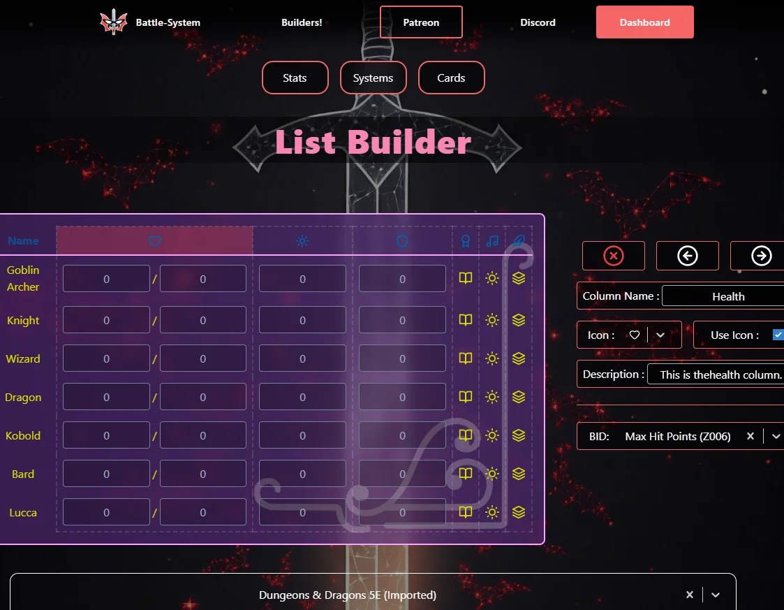
The Lists page is where you design the unit tracker list — the horizontal table row that appears for each unit in the GM's initiative tracker in Owlbear Rodeo. You are building a row of columns, each showing a specific piece of data.
1. What is a List Layout?
A list layout is a table row of configurable columns. At the far left are fixed Initiative and Name columns. Beyond those, you can add custom columns linked to one or more attributes or to a system feature like Effects.
The list layout is what the GM sees on their screen for every unit in the encounter. It is designed to give at-a-glance access to the stats that matter most during play.
2. Selecting a System
Use the Select a Game System dropdown at the top to choose which system's list layout you are editing. The dropdown pulses red until a selection is made.
3. The Fixed Columns
The Initiative and Name columns are permanent: they always appear first (leftmost), cannot be removed, and cannot be reordered or reconfigured.
4. Adding Columns
On the left sidebar (desktop) or the scrollable carousel (mobile), select a column type and click Add Column. The new column will appear at the right end of the list preview.
5. Selecting a Placed Column
Click on any non-fixed column in the list preview to select it. When selected:
- The column is highlighted with a red tint.
- The configuration panel on the right shows that column's settings.
- The Remove and Move buttons become active.
6. Moving Columns
With a column selected, use the Move Left and Move Right buttons to reposition it. The fixed Initiative and Name columns can never be moved.
7. Removing Columns
With a non-fixed column selected, click the Remove Column button to delete it from the layout.
8. Saving a Layout
Click Save Layout when you are satisfied with the column arrangement. The layout is validated before saving — if a required BID is not filled in or a required field is missing, the save will be blocked and error messages will be shown for each problematic column.
9. All List Column Types
Text & Number Column
What it does: Displays the value of one (or up to three) Text or Number attributes in cells for each unit. When multiple BIDs are configured, values are shown in sequence separated by an optional divider character you specify.
Common use: HP, AC, Speed, Level — any number or text value you want visible on the tracker at a glance.
Configuration Options:
| Option | Description |
|---|---|
| BID 1 | The primary attribute to display. Required. |
| BID 2 | A secondary attribute shown next to BID 1 (optional). |
| Divider 1 | A single character that separates BID 1 and BID 2 (e.g. /). |
| BID 3 | A tertiary attribute (optional, only shows if BID 2 is set). |
| Divider 2 | Character between BID 2 and BID 3. |
| Column Name / Icon | Header label shown at the top of the column. |
| Description | Tooltip text shown when hovering the column header. |
Derived Value Column
What it does: Displays the computed result of one or more Derived attributes per unit. Values are read-only and auto-calculated.
Configuration Options: Same as the Text & Number Column, except the BID slots only accept Derived-type attributes.
Select Dropdown Column
What it does: Displays the currently selected option of a Select (Enum) attribute per unit. In-game the player can change the selection from the list directly.
Configuration Options:
| Option | Description |
|---|---|
| BID | Which Enum attribute to display. |
| Column Name / Icon / Description | Header configuration. |
Resource Column
What it does: Displays the current/max values of a Resource attribute per unit. Players can adjust the current value directly in the list.
Configuration Options:
| Option | Description |
|---|---|
| BID | Which Resource attribute to display. |
| Column Name / Icon / Description | Header configuration. |
Checkbox Column
What it does: Displays checkboxes per unit for one or more True/False attributes. Each BID you configure adds another checkbox. Players can toggle them directly in the list.
Configuration Options:
| Option | Description |
|---|---|
| BID 1–6 | Which True/False attributes each checkbox maps to. |
| Column Name / Icon / Description | Header configuration. |
Lists Column
What it does: Gives each unit a button in the column that expands to show their List attribute entries (the same list that would appear from an Action List or Item List on their card). Useful for quick-access to actions and inventory from the tracker.
Configuration Options:
| Option | Description |
|---|---|
| BID | Which List-type attribute to display when expanded. |
| Column Name / Icon / Description | Header configuration. |
Special Column
What it does: Adds a system-level feature column. Currently two Special types exist:
| Special Type | Description |
|---|---|
| Effects | Adds a sparkle/effects icon button per unit. Clicking it opens an effect-tracking popup where the GM can set named effects with round durations. Effects expire automatically as turns advance. |
| Elevation | Adds an elevation indicator icon per unit. Clicking opens an elevation input. The current elevation is also drawn visually on the unit's token in-game. |
Configuration Options:
| Option | Description |
|---|---|
| Special Type | Effects or Elevation. |
| Column Name / Icon / Description | Header configuration. |
Divider Column
What it does: A narrow decorative column that visually separates other columns. No data, no BID — purely aesthetic. Six style options available.
| Style | Appearance |
|---|---|
| Default | A thin vertical gradient line fading to transparent at both ends. |
| Dashed | A thin dashed line in the border color. |
| Shadow | A slightly wider soft glow effect using the border color. |
| Zigzag | A small SVG zigzag pattern drawn in the border color. |
| Ridge | A recessed/embossed border look. |
| Pulse | A thin line that pulses its opacity in and out continuously. |
10. Configuring a Column's Name and Icon
Every non-fixed, non-divider column type has a section at the top of its configuration panel for its header appearance:
| Setting | Description |
|---|---|
| Column Name | The text shown in the column header. Up to 16 characters. |
| Icon | Pick an icon from the 40+ icon library. |
| Use Icon | When checked, the column header shows the icon instead of the text name. |
| Description | A tooltip text up to 120 characters shown when the user hovers over the column header in the preview. Useful for explaining what a column represents. |
Getting Started — The Workflow
Using Forge out of the box (D&D 5e, zero setup)
- Add Forge to your Owlbear Rodeo room from the OBR extension store.
- Open the Forge panel — the built-in D&D 5e system loads automatically.
- Add token images to your scene. Each token appears as a row in the initiative tracker.
- Click the dice icon next to a unit to roll initiative, or click the initiative value and type one in.
- Right-click any token on the map and select View [Unit Name] to open its Unit Card and fill in stats.
- Play.
Using a custom system
- Build your system on the Battle-System website (see Building Custom Systems for the full guide).
- On the website, copy your system's Share ID.
- In Forge, open the System page from the navigation menu.
- Paste the Share ID into the field and click Import System.
- Your custom card and list layouts are now active for all units in the room.
Tips and Tricks
Note: Tips 1–8 below relate to building custom systems on the Battle-System website. Tips 9–10 cover general extension usage.
1. Use Groups to Stay Organized
If you are building multiple game systems with many attributes, the Group field on the Stats page is your best friend. Tag all D&D 5e attributes with "DND5E", all Pathfinder attributes with "PF2E", and so on. You can then sort the table by Group to quickly see which attributes belong to which game. Groups do not affect gameplay — they are purely for your own organization.
2. BID Design Strategy
Spend time upfront designing a logical BID scheme for your system. Good BIDs are:
- Short: 3–4 characters is the sweet spot (STR, HP, LVL, AC).
- Memorable: Use standard gaming abbreviations where possible.
- Stable: Changing a BID after you have data stored against it is disruptive. Plan before you create.
- Reusable: If you plan to run multiple systems, give equivalent attributes the same BID across both systems. Players' data will automatically transfer.
3. Pairing Column-Text Labels with Column-Text & Number Inputs
The most common card pattern is a labeled stat grid. To build it:
- Add a Column-Text Labels component (full-size) and assign the BIDs of your 6 stats.
- Immediately below it, add a Column-Text & Number Input component and assign the same BIDs in the same order.
The labels will line up perfectly over the inputs, giving you the classic ability-score grid look.
4. Building Modifier Rows
For D&D-style ability score modifiers:
- Create Derived attributes for each modifier with formulas like
floor((@STR - 10) / 2). - Place a Column-Derived Values component below your stat inputs.
- Configure the derived column to reference the modifier attributes.
The modifiers auto-update whenever the base score changes.
5. Theming Tips
- Use your game's brand colors or the colors of your table's play style.
- The Background color works best as a dark, slightly transparent value — the card overlay effect is most readable with a dark background.
- The Offset color (label text) should contrast against both the Background and the Primary colors — it reads best as a mid-tone or accent color.
- Choose a Border color that is slightly brighter than the Background but not as bright as the Primary — it should define edges without competing with the content.
6. Use the Divider Column to Break Up Busy Trackers
If your list has many columns, a Divider Column (especially the Shadow or Pulse style) can visually group columns into logical sections (e.g. Combat Stats | Skill Modifiers | Resources) at a glance without taking up meaningful space.
7. Derived Attributes for Passive Values
Things like Passive Perception, Initiative Modifier, Passive Investigation, or Spell Save DC are perfect candidates for Derived attributes. Once set up, they update automatically — no more mental math at the table.
8. List Attributes for Spells and Abilities
Set up a List attribute for Spells, one for Actions, one for Equipment, and one for Traits. Assign all four to your system. Use Actions List and Items List components on the card. Players add and name their own entries — you do not need to build it out per creature.
9. Sharing Systems
If you are building a system for a group, take advantage of Share IDs. Build one polished system, copy the Share ID from the Systems page (click the Copy button next to it), and share the ID with your players or other GMs. They can import your system directly into their own Forge account.
10. The Default System as a Template
Even if you are not running D&D, the Default System is a useful learning tool. Import it, study the attribute structure, theme, card layout, and list layout. Understanding how a complete system is put together will give you a clear model to follow when building your own.
Support
If you have questions or run into issues, you can reach out through the following channels:
- Join the Owlbear Rodeo Discord for community discussion.
- Email at [email protected] for direct support.
- Support development at the Battle-System Patreon.